This UI control allows you to seamlessly integrate Scalable Vector Graphics into your cross-platform mobile applications built with the .NET MAUI tech stack.
<svg:SvgImage Source="logo.svg" HeightRequest="32" /><Button Text="Add" ContentLayout="Right,20"
ImageSource="{svg:Svg tabHome.svg,Height=60, ColorMapping='000000=>FF0000'}" />| Maui and Native iOS + Android on net8/9 |
|---|
  |
 |
SVG
This UI control allows you to seamlessly integrate Scalable Vector Graphics into your cross-platform applications:
- SVG ensures high-quality visuals across different devices and screen sizes
- SVG enhances the user experience with crisp and responsive graphics
- SVG files are lightweight and efficient, having a fraction of the size of raster images (JPG, PNG). They reduce load times and improve performance.
Use Cases:
- Use SVGs for app icons, menu and toolbar items, and inside buttons to maintain a consistent and sharp appearance across various resolutions and devices.
- Branding Elements: Incorporate SVG logos and branding elements that remain crisp and clear, regardless of the device or screen size.
Enterprise support available: contact Vapolia
AI Assistant Plugin (Claude Code)
Get instant, context-aware help with this component directly inside your AI coding assistant — no documentation browsing required.
Install the plugin in two commands (no cloning needed):
/plugin market add vapolia/Svg-Samples
/plugin install vapolia-svg@vapolia-plugins
Once installed, your AI assistant automatically knows how to set up Vapolia.Svg, write SvgImage and SvgImageSource XAML, apply color mappings, configure embedded resources, and troubleshoot common issues — for MAUI, native Android, and native iOS.
Compatible with Claude Code, Cursor, GitHub Copilot, Gemini CLI, and any tool supporting the Agent Skills open standard.
SvgImage and SvgImageSource
.net Maui Controls:
SvgImagedisplays an SVG imageSvgImageSourcedisplays an SVG inside buttons, tabs or for any ImageSource.- Supports Android (23), iOS (14.2) and Windows (10.0.19041.0)
.net Native Controls (without maui):
- Android:
SvgImageViewandSvgPictureDrawable - iOS:
UISvgImageViewwith support for xcode designer - Windows:
Svginherited fromCanvas
Quick start for MAUI
In MauiProgram.cs, add .UseEasySvg() to the builder
builder
    .UseMauiApp<App>()
    .UseEasySvg();
Add some SVG images
- Create a new folder named
VectorImagesin your project. Do not use the existingResources/Imagesfolder ! - place your SVG images there, ensuring they have the
.svgextension. - add the following lines to your
.csprojfile:
<ItemGroup>
  <None Remove="VectorImages\**\*.svg" />
  <EmbeddedResource Include="VectorImages\**\*.svg" />
</ItemGroup>
That configures the svg images as embedded resources.
In a XAML page, use SvgImage or SvgImageSource
<?xml version="1.0" encoding="utf-8" ?>
<ContentPage xmlns="http://schemas.microsoft.com/dotnet/2021/maui"
             xmlns:x="http://schemas.microsoft.com/winfx/2009/xaml"
             xmlns:svg="https://vapolia.eu/svg"
             x:Class="XamSvg.Demo.MainPage"
             IconImageSource="{svg:Svg myicon.svg,Height=60}">

  <ContentView>
    <StackLayout Orientation="Vertical" VerticalOptions="Start">

        <svg:SvgImage Source="logo.svg" HorizontalOptions="Start" HeighRequest="32" />

        <svg:SvgImage Source="logo.svg" HorizontalOptions="Start" HeighRequest="32"
                      ColorMapping="{Binding ColorMapping}"
                      ColorMappingSelected="ffffff=>00ff00,000000=>0000FF"
                      />

        <svg:SvgImage WidthRequest="100" Source="https://upload.wikimedia.org/wikipedia/commons/1/15/Svg.svg" />

        <svg:SvgImage WidthRequest="100" Source="data:image/svg+xml;base64,PD94bWwgdmVyc2lvbj0iMS4wIiBlb..." />

        <Image Source="{svg:Svg Source=no_image_available.svg, Width=40, ColorMapping='000=>666'}"
               WidthRequest="40" />

    </StackLayout>
  </ContentView>
</ContentPage>
Remarks:
- The
xmlns:svgattribute is required on theContentPage. Sourceis the name of an svg image. This image is searched in embedded resources across all loaded assemblies. This list is cached on first use.- All properties are bindable.
You can also use <SvgImageSource Svg="...." Height="50" /> as the ImageSource for tab icons, button icons, navigation bar icons, and more.
For these elements, the Widht and/or Height properties are mandatory and cannot be bound, as ImageSource objects are static in MAUI (a MAUI limitation).
The compact syntax ImageSource="{svg:Svg refresh.svg,Height=50}" is easier to use.
Note: SvgImageSource converts the svg image into a static raster image, which is then displayed by another UI control like Image. As a result, it supports only one ColorMapping.
Color Mapping
The ColorMapping, ColorMappingSelected and ColorMappingDisabled properties allow you to modify specific colors in the SVG before displaying it, or based on its state (normal, selected, disabled).
For example, the string ffffff=>00ff00 000000=>0000FF means:
- replace
ffffff(white) by00ff00(green) - and replace
000000(black) by0000FF(blue).
A color mapping is a string containing a list of mappings separated by ",", ";", or a space.
Each mapping consists of two parts, separated by "=>" (or "="). The left part is the color to replace, and the right part is the new color.
A color is a standard HTML color code in one of the following format: AARRGGBB, RRGGBB, or RGB. A is the transparency (alpha channel).
Color mappings are bindable: instead of specifying a string, you can use a list of ColorMapping objects:
<svg:SvgImage Source="logo.svg" HorizontalOptions="Start" HeighRequest="32">
    <ColorMapping OldColor="Blue" NewColor="#80000000" />
    <ColorMapping OldColor="#FFF" NewColor="{Binding YourColorProperty}" />
</svg:SvgImage>
Maui samples
Simple svg image
<svg:SvgImage Source="logo.svg" HeightRequest="70" HorizontalOptions="Center" VerticalOptions="Center" />
Svg image on a button
<Button Text="Add Contact" ContentLayout="Right,20" ImageSource="{svg:Svg tabHome.svg,Height=60,ColorMapping='000000=>FF0000'}" />
Svg image for the icon of a TabbedPage tab
<NavigationPage Title="Home" IconImageSource="{svg:Svg tabHome.svg,Height=60}">
  <x:Arguments>
      <views:HomePage />
  </x:Arguments>
</NavigationPage>
Svg image with bindable color mapping
<svg:SvgImage Source="logo.svg" HeightRequest="60">
    <!-- the ColorMapping property is the default content property: no need to embed it into a svg:SvgImage.ColorMapping tag -->
    <svg:ColorMapping OldColor="#000" NewColor="{Binding CurrentColor}" />
    <svg:SvgImage.ColorMappingSelected>
        <svg:ColorMapping OldColor="#000" NewColor="{Binding CurrentColor}" />
    </svg:SvgImage.ColorMappingSelected>
</svg:SvgImage>
Sources
The SvgImage.Source property accepts a string value with a scheme prefix that indicates where the SVG data is loaded from. The following schemes are supported:
string:— the SVG content is provided directly as a string.- Example:
string:<svg xmlns="http://www.w3.org/2000/svg" ... >...</svg>
- Example:
res:or none — the name of an embedded resource (an SVG file).- Example:
res:MyApp.Images.logo.svg - Example:
logo.svg
- Example:
file:— a native resource file bundled with the app (platform-specific).- Example:
file:logo.svg
- Example:
nfile:— a native file on the device's file system (platform-specific).- Example:
nfile:/data/user/0/com.myapp/files/image.svg
- Example:
https:orhttp:— a URL pointing to a remote SVG file.- Example:
http://example.com/image.svgorhttps://example.com/image.svg
- Example:
If no scheme is provided, the default behavior is typically equivalent to using the res: scheme (embedded resource).
Alternatively, you can define you own custom SvgSource.
Common mistakes
If nothing appears, ensure your svg file is displayed correctly in Windows Explorer (after installing this extension).
Common errors include:
- Forgetting to set the build action of the svg file to "Embedded resource".
- Missing the
viewBoxattribute at the root of the svg file (open it using a text editor to check). - The svg color being the same as the background color, especially white or black. Use ColorMapping to adjust the colors, or edit your svg file using inkscape or your preferred editor.
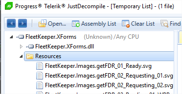
The assembly containing the svg resources must have an Assembly Name that matches its Default Namespace. Otherwise, the svg files will not be found. If you cannot do this, you can still display an svg by specifying the full resource name, like this:
    <svg:SvgImage
        Source="YourDefaultNamespace.Images.getFDR_01_Ready.svg"
        x:Name="SvgIcon" HorizontalOptions="Fill" VerticalOptions="Start" Margin="8,0,8,0" BackgroundColor="Yellow"
        />
You can discover the full name of an embedded resource by opening your assembly (.dll in your bin folder) with the free tool Telerik JustDecompile.
Another common mistake is setting the ImageSource of a Button in a style or trigger. Instead, you must set the Image property.
<Style x:Key="FAB" TargetType="Button">
  <!-- correct -->
  <Setter Property="Image" Value="{svg:Svg create.svg,Height=50,ColorMapping='000=>634109'}"/>
  <!-- incorrect
  <Setter Property="ImageSource" Value="{svg:Svg create.svg,Height=50,ColorMapping='000=>634109'}"/>
  -->
</Style>
Other Recipes
Use a bindable color mapping, where CurrentColorTheme.TextColor is of type Color.
    <svg:SvgImage
        Command="{Binding ShowSettingsCommand}"
        SemanticProperties.Hint="Open settings"
        HeightRequest="40"
        HorizontalOptions="Start"
        Source="settings.svg"
        BackgroundColor="#01000000"
        ColorMapping="{Binding CurrentColorTheme.TextColor, Converter={StaticResource ColorToBlackColorMappingStringConverter}}" />
ColorToBlackColorMappingStringConverter.cs :
[AcceptEmptyServiceProvider]
public class ColorToBlackColorMappingStringConverter : BaseConverter<Color, ColorMappings>
{
    /// <inheritdoc/>
    public override ColorMappings DefaultConvertReturnValue { get; set; } = string.Empty;

    /// <inheritdoc/>
    public override Color DefaultConvertBackReturnValue { get; set; } = Transparent;

    /// <inheritdoc/>
    public override ColorMappings ConvertFrom(Color value, CultureInfo? culture)
    {
        ArgumentNullException.ThrowIfNull(value);
        return $"000=>{value.ToArgbHex()[1..]}";
    }

    /// <inheritdoc/>
    public override Color ConvertBackTo(ColorMappings value, CultureInfo? culture)
        => throw new NotSupportedException();
}
Android native (not MAUI Android): set the SVG image height the match the height of a Button
Click to expand
<?xml version="1.0" encoding="utf-8"?>
<android.support.constraint.ConstraintLayout
              xmlns:android="http://schemas.android.com/apk/res/android"
              xmlns:app="http://schemas.android.com/apk/res-auto"
              xmlns:tools="http://schemas.android.com/tools"
              android:layout_width="match_parent"
              android:layout_height="match_parent">
    <Button
        android:id="@+id/myinfo"
        app:layout_constraintTop_toTopOf="parent"
        app:layout_constraintLeft_toLeftOf="parent"
        app:layout_constraintRight_toRightOf="parent"
        android:layout_width="0dp"
        android:layout_height="wrap_content"
        android:text="@string/Menu_MyInfo"
        style="@style/Widget.AppCompat.Button.Borderless"
        app:MvxBind="Click SettingsCommand"
        />
    <vapolia.SvgImageView
        app:layout_constraintTop_toTopOf="@+id/myinfo"
        app:layout_constraintBottom_toBottomOf="@+id/myinfo"
        app:layout_constraintLeft_toLeftOf="parent"
        android:layout_width="wrap_content"
        android:layout_height="0dp"
        tools:layout_width="30dp"
        app:colorMapping="000000=e01a1a"
        app:colorMappingSelected="000000=ff3030"
        app:colorMappingDisabled="000000=1a1a1a"
        app:aspect="fit"
        app:svg="info.svg" />
Note that since the SVG has an intrinsic width calculated from its height and aspect ratio, the width displayed by the designer is incorrect. You can correct this in the designer by assigning a design-time only value to layout_width using the tools prefix: tools:layout_width="30dp" which requires the xmlns:tools namespace declaration.
Android native (not MAUI Android): set the icon for the back button in the toolbar
var toolbar = FindViewById<Toolbar>(Resource.Id.toolbar);
toolbar.NavigationIcon = SvgFactory.GetDrawable("backward.svg", "000000=>FFFFFF");
iOS/Android: Load an SVG from a background thread
Click to expand
See [this gist](https://gist.github.com/softlion/17aea986a8ea3594595ddf869ee49b37)iOS storyboard (not maui ios): usage in an xcode storyboard
Click to expand
Open your storyboard file using `Open with xcode`. Add an Image view (UIImageView), set its custcom `Class` property to `UISvgImageView`, and optionally add a new `User Defined Runtime Attributes` as required:
| Key Path | Type | Sample Value |
|---|---|---|
| BundleName | String | info.svg |
| ColorMapping | String | 000000=e01a1a |
| ColorMappingSelected | String | 000000=ff3030 |
To size your svg, set contraints on only one dimension. The other dimension will be calculated based on the first dimension and the SVG's aspect ratio. If you set constraints on both dimensions, the SVG will stretch. You can prevent this by setting Aspect to Fit (along with ContentMode set to AspectFit):
| Key Path | Type | Sample Value |
|---|---|---|
| Aspect | String | Fit |
When only one dimension is constrained, the designer cannot determine how to set the other dimension and will display contraint errors. The solution is to set the intrinsic size to a manual value in the dimension that has no contraint (in the dimension property pane of the designer).

- Select the
UISvgImageViewview. - Open the size inspector (⌘Shift5).
- Change the "Intrinsic Size" drop-down from "Default (System Defined)" to "Placeholder."
- Enter a reasonable estimate for your view's runtime width or height. Use Width if you have set contraints on the height, and height otherwise.
These constraints are removed at compile-time, meaning they will not affect your running app. The layout engine will add constraints as necessary at runtime to respect your view's intrinsicContentSize.
Reference
MAUI
Default namespace:
xmlns:svg="https://vapolia.eu/svg"
SvgImage control
SvgImage displays an image in up to two states: normal, selected
<svg:SvgImage Source="union.svg" HeightRequest="70" HorizontalOptions="Center" VerticalOptions="Center" />
| Property | Type | Notes |
|---|---|---|
| Source | string or SvgSource |
svg to display. |
| ColorMapping | string or ObservableCollection<ColorMapping> |
see color mapping reference. Default to none. |
| ColorMappingSelected | string or ObservableCollection<ColorMapping> |
color mapping when IsSelected="True". Default to none. |
| IsSelected | bool | used to switch color mapping |
| IsSelectionEnabled | bool | True by default: the value of IsSelected is also inherited from the parent container |
| Command | ICommand | if set, execute this command on tap |
| CommandParameter | object | parameter to send when calling Command.Execute |
| Width | double | Optional. You can also specify the width only and height will be computed from the aspect ratio |
| Height | double | Optional |
| Aspect | SvgAspect | Fit, Fill, FitCrop. Useful only if both width and height are forced. Default to Fit to maintain the aspect ratio. |
| IsLoadAsync | bool | set to False to disable async image loading, making the image appear immediatly. Default to True. |
| IsHighlightEnabled | bool | if set, ColorMappingSelected is used while the image is pressed (until the finger is released) |
| ViewportTransform | IMatrix | transform the svg using any matrix before displaying it |
SvgImageSource class
SvgImageSource inherits from ImageSource, use it on any ImageSource property. For example Page.IconImageSource.
It can also be transformed into a FileImageSource by calling CreateFileImageSource().
SvgImageSource can be used in Button.ImageSource, ToolbarItem.IconImageSource, ...
<svg:SvgImageSource Source="tabHome.svg" Height="50" />
| Property | Type | Notes |
|---|---|---|
| Source | string or SvgSource |
svg to display. |
| Width | double | Optional. You can also specify the width only and height will be computed from the aspect ratio. |
| Height | double | Optional. |
| ColorMapping | string or ObservableCollection<ColorMapping> |
see color mapping reference. Default to none. |
| Aspect | SvgAspect | Fit, Fill, FitCrop. Useful only if both width and height are forced. Default to Fit to maintain the aspect ratio. |
| PreventTintOnIos | bool | Default to false. Prevents tinting on iOS, thus always displaying the original image. |
All properties are bindable, but Xamarin Forms does not support changing them after the control using this SvgImageSource is rendered. Alternatively, you can bind the ImageSource property on the target control, and define SvgImageSource in styles. Example:
    <svg:SvgImageSource x:Key="NormalIcon" Source="icon_normal.svg" Height="80" />
    <svg:SvgImageSource x:Key="SelectedIcon" Source="icon_selected.svg" Height="80" ColorMapping="FFF=>000" />

    <Style x:Key="NormalIconStyle" TargetType="ImageButton">
      <Setter Property="Source" Value="{StaticResource NormalIcon}"/>
      <Setter Property="BackgroundColor" Value="Transparent"/>
    </Style>

    <Style x:Key="SelectedIconStyle" TargetType="ImageButton">
      <Setter Property="Source" Value="{StaticResource SelectedIcon}"/>
      <Setter Property="BackgroundColor" Value="Transparent"/>
   </Style>
And usage:
<ImageButton Style="{Binding StyleKeyToUse}" />
     public string StyleKeyToUse {get;set;} = "NormalIconStyle";
     //Don't forget to call OnPropertyChanged(nameof(StyleKeyToUse)) after each change.
Android native (not maui android)
Click to expand
Layout properties:| Tag | Type | Default value | Notes |
|---|---|---|---|
| app:svg | string or resource id | (required) | .net embedded resource file path and name, or android resource id |
| app:colorMapping | string | (null) | example: FF000000=FF808080 |
| app:colorMappingSelected | string | (null) | example: FF000000=FFa0a0a0;FFFFFFFF=00000000 |
| app:colorMappingDisabled | string | (null) | |
| app:traceEnabled | bool | false | |
| app:loadAsync | bool | true | |
| app:aspect | enum | fit | fit, fill of fit_crop (new v3.1.0). fit_crop: Scale the image uniformly (maintain the image's aspect ratio) so that both dimensions (width and height) of the image will be equal to or larger than the corresponding dimension of the view (minus padding). |
| android:adjustViewBounds | bool | true | if true and aspect is not Fill, the svg view will grow or shrink depending on the svg size. |
| android:autoMirrored | bool | false | true to mirror image in RTL languages |
android:padding is respected, and included in the width/height measurement.
android:gravity is respected, and included in the width/height measurement. If the svg is smaller than its view, this property controls its centering.
iOS native (not maui ios)
Click to expand
UISvgImageView inherits UIImageView, so it's easy to use it in an xcode storyboard: drag an UIImageView and set its custom class to UISvgImageView. To set specific svg properties, add User Defined Runtime Attributes in the same pane where you set the custom class.
Attributes (supported in User Defined Runtime Attributes):
| Key Path | Type | Default value | Notes |
|---|---|---|---|
| BundleName | string | (required) | Svg path. Example: res:images.logo |
| BundleString | string | (optional) | exclusive with BundleName. The svg content as a string. |
| ColorMapping | string | (null) | example: FF000000=FF808080 |
| ColorMappingSelected | string | (null) | example: FF000000=FFa0a0a0;FFFFFFFF=00000000 |
| TraceEnabled | bool | false | |
| IsLoadAsync | bool | true | set to false to force the svg to appear immediatly, or if it disappears sometimes |
| AlignmentMode | string | TopLeft | TopLeft, CenterHorizontally, CenterVertically, Center. Can be combined (in code only). |
| Aspect | string | Fit | Fit, Fill, FitCrop. |
| FillWidth | number | 0 | The width the svg would like to have. 0 to let the OS decides using UI constraints or Frame value. |
| FillHeight | number | 0 | The height the svg would like to have. 0 to let the OS decides using UI constraints or Frame value. |
UIImageView.ContentMode is forced by UISvgImageView, so it has no impact. Use Aspect instead.
Advanced configuration
The SVG files that don't specify the full path of an assembly are automatically searched in the embedded resources of all loaded assemblies. If you have assemblies that are loaded late and not detected, or if you prefer to manually specify the assemblies, call AddResourceAssembly. Example:
public class App : Application
{
    public App()
    {
        Vapolia.Svgs.Config.AddResourceAssembly(typeof(App), ...);
        ...
    }
...
Limitations
On Windows, IsLoadAsync is ignored and is always true.
On Windows, SvgImageSource uses the Microsoft Windows SVG renderer, which has its own limitations, and does not support ColorMappings.
On Windows, to be able to get the Command to fire, you must set BackgroundColor="#01000000" or use any other non transparent color. The default is transparent.
Texts and bitmaps inside SVGs are never rendered. The reason is, when you scale text on high res devices they become oversized.
A few svg tags are ignored, like the pattern tag.
But:
- svg styles are fully supported
- the InnerSize property (which is the original declared size of the SVG) is useful to compute a scale between the original SVG and the displayed version, making programmatic SVG powerful to manipulate on screen.
If
IsLoadAsyncis false, this property is set immediately afterSourceis set.
Tools
On Windows install the microsoft powertoys to preview the SVG files in the Windows Explorer.
Supported Platforms
- Maui, net-iOS (without maui), net-Android (without maui)
- Android api level 23+
- iOS 14.2+
- Windows 10.0.19041.0+
Mvvm friendly
This control provides an event and a Command when the image is tapped, making it easy to use with or without mvvm frameworks.
It also implements INotifyPropertyChanged.
Live Preview
This control supports hot reload and live preview.